Apple’s Next Move: The iPhone 17 Air
Alright, so Apple isn’t just dropping another phone next year—they’re about to shake up the whole iPhone vibe with the iPhone 17 Air, supposedly landing in 2025. This isn’t your average “S” year upgrade either. Think even slimmer, even lighter, basically like your current iPhone went on a juice cleanse and started doing Pilates. Rumors are flying—thanks to leakers like “Fixed Focus Digital” and a bunch of Apple-watching insiders—that we’re getting four fresh colors, each picked like they’re auditioning for a minimalist art museum.
What’s New With the iPhone 17 Air?
- Ultra-thin, ultra-light: Supposedly, this will be the thinnest iPhone ever. Like, “forget it’s in your pocket until it buzzes” thin.
- Design shift: Apple’s leaning hard into modern, minimalist vibes—think less “flashy” and more “effortlessly cool.”
- Four color options: Each shade is chosen to match Apple’s obsession with design, but there’s one that’s clearly the star of the show (more on that in a sec).
Let’s break down what we know so far—color by color.
The Color Lineup: iPhone 17 Air’s Palette
Apple’s always been weirdly good at picking colors that feel both fancy and chill at the same time. For the iPhone 17 Air, they’re keeping that tradition alive with a set of four shades. Here’s the rundown:
1. Black
- The classic: You can’t go wrong here. Black’s been the gold standard for anyone who wants their phone to look sharp, maybe a little mysterious.
- Why people love it: It’s professional, it’s low-key, and let’s be real, it hides smudges better than the light ones.
- Vibe check: This is for the folks who want their gadgets to blend in at work or maybe just don’t care to stand out. Reliable, safe, timeless. You could bring this one to a boardroom or a bar and it wouldn’t look out of place.
2. Silver
- The Apple signature: Silver has been in Apple’s DNA forever, showing up on everything from MacBooks to AirPods.
- What makes it pop: It’s got that polished, almost mirror-like finish that screams “I’m successful but not trying too hard.” It’s bright, but not blinding.
- Who’s into it?: People who want their phone to look as clean as their desk (or at least want to pretend). It’ll probably make that super-slim design look even sleeker.
3. Light Gold
- Not-your-grandma’s gold: This isn’t some gaudy, bling-bling gold. We’re talking soft, subtle, a little bit of class without the flash.
- Why it’s cool: It’s got a gentle shimmer—enough to get noticed, but not so much you feel like you’re carrying a trophy.
- Perfect for: Anyone who wants a touch of luxury but isn’t about to pull out a solid gold phone on the subway. It’s grown-up, but not boring.
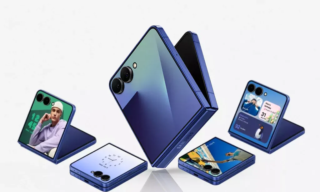
4. Light Blue
- The wildcard: This color’s the one Apple’s really hyped about, and honestly, it’s easy to see why.
- What’s different: It’s not that deep, moody blue from older iPhones. This is light, airy, almost like a clear sky on a good day. If you’ve seen the new MacBook Air M4 in Sky Blue, you know what’s up.
- Target audience: Apple’s gunning for younger folks, trendsetters, and anyone who wants something fresh and a bit playful.
- Marketing focus: Expect to see Light Blue everywhere—ads, billboards, your favorite influencer’s hands. It’s the new face of the iPhone.
The Design Direction: Slimmer, Lighter, Cooler
Let’s be real: Apple’s been slowly making everything thinner for years, but the iPhone 17 Air is supposed to be next-level. They’re borrowing the “Air” branding from the MacBook Air, which is basically the international symbol for “you can toss this in your bag and forget about it.”
- Portability is king: People want gadgets that don’t weigh them down. The iPhone 17 Air looks like Apple’s ultimate answer to that.
- No compromise: Even as they’re shaving off millimeters, they’re not about to drop the ball on build quality or performance. That’s the plan, anyway.
- Colors match the vibe: All four shades are light, elegant, and designed to make the phone look even slimmer than it already is. It’s not about showing off, it’s about making everyday tech feel a bit more special.
Why These Colors Actually Matter
Apple doesn’t just toss a dart at a color wheel. There’s strategy here, trying to rope in everyone from old-school fans to the TikTok crowd.
- Black & Silver: For the traditionalists and the professionals. If you want something familiar, or you just don’t want to think about color every day, these are for you.
- Light Gold: For people who want a bit of flair, but not too much. It’s like ordering a fancy latte instead of plain coffee.
- Light Blue: For the bold, the young at heart, or anyone who just wants their phone to feel a little bit different.
Plus, there’s a whole psychology to it. Light colors like silver and light blue make the phone feel lighter, less bulky, even if the scale doesn’t agree. It’s a neat little mind trick, and Apple’s definitely playing into it.
Apple’s Marketing Play: All Eyes on Light Blue
So, here’s the big marketing move—Light Blue is gonna be the color for the iPhone 17 Air. If you remember how Product Red or Midnight got their own spotlights, this is the new star.
- Inspired by MacBook Air: They’re basically taking the Sky Blue energy from the MacBook and running with it.
- Front and center: Expect to see Light Blue in every ad, every launch event, probably even on those huge Apple Store banners (you know the ones).
- Message?: Apple wants you to associate this blue with the next era of iPhone—lighter, brighter, maybe even a little more fun than before.
Final Thoughts: A New Era for iPhone
Honestly, it feels like Apple’s using the iPhone 17 Air as an excuse to start fresh. Thinner, lighter, with colors that are both modern and classic. They’re not just making a new phone—they’re setting a new tone for the whole lineup.
- Lighter in your pocket, lighter on the eyes.
- A color for every type of user, from the business crowd to the trend chasers.
- And that Light Blue? Get ready, you’re about to see it everywhere.
So yeah, if you’re bored of the same-old iPhone look, this next chapter might actually be worth getting hyped about.


